A KPI dashboard is the tool for monitoring performance, detecting anomalies and substantiating action. However, building good dashboards remains a profession in its own right. In this article, you'll not only discover what a KPI dashboard is exactly, but you'll also get concrete examples by department, insights into good vs. bad visualizations, design best practices, and an overview of popular tools. Ideal for managers, analysts and entrepreneurs who want to turn data into a control tool.
What is a KPI dashboard?
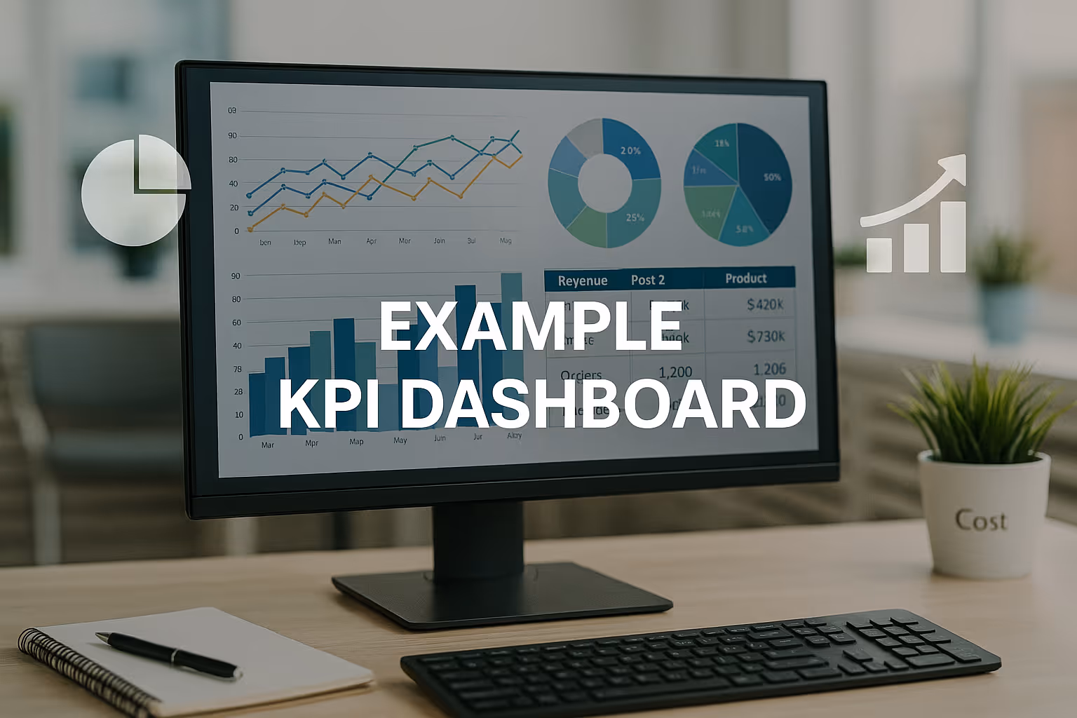
A KPI dashboard is a visual representation of your key performance indicators. It shows the status of your company, team or process on one screen, often in real-time. The goal? Understand at a glance what is going well, where adjustments are needed and what requires priority.
What is the difference with reporting?
Why KPI dashboards are important
- They increase decisiveness: data translated into insights
- They make performance negotiable: in teams, meetings, daily meetings
- They reduce focus on turnover: focus on margin, retention, costs and quality
- They encourage ownership: everyone sees what matters
Good and bad visualizations
Not every graph is a dashboard. Visualizations must be fast and interpretable correctly. Bad charts lead to confusion, frustration, or even wrong decisions.
Bad examples
- 3D pie charts with too many segments
- Colors that have no meaning
- Charts without titles or units
- 100-row tables with too small text
- KPI maps without context or trend
Good visualizations
- Bar charts: for comparison between categories
- Line and area charts: for trends over time
- KPI cards: for quick status (green/yellow/red)
- Funnel charts: for conversion or churn
- Heatmaps: for performance by region or team
Rules for clear dashboards
- Up to 5 graphs per screen
- Use intuitive colors (green = good, red = bad)
- Show comparison with target or last year
- Use filtering for drill-down
- Ensure consistency in layout and chart types
Examples by department (sales, finance, HR)
KPI sales dashboard
Application: monitoring targets, margins and sales performance
Visualizations:
- Revenue vs. target by seller or region (bar graph)
- Net margin per product line (line graph or KPI map)
- Winrate in the sales pipeline (funnel)
- Customer conversion by source (pie chart)
- Average deal value and sales cycle length
Learn more about sales KPIs: Sales dashboards provide insight into sales, conversion rates and pipeline per seller, find out which KPIs are crucial here.
KPI dashboard for finance
Application: profitability, cash flow and cost management
Visualizations:
- Revenue vs. gross margin vs. net profit (line and bar)
- Costs by category (pie + evolution)
- Days of outstanding invoices (DSO)
- Cash flow per month (area graph)
- Forecasting versus realization
Learn more about finance KPIs: Financial dashboards translate your accounting into control information, these KPIs make margins and cash flow tangible.
KPI dashboard for HR
Application: staff retention, absenteeism and recruitment
Visualizations:
- Number of vacancies and filling time
- Expiration ratio and retention rates (line)
- Sick leave by month (bar chart)
- Engagement Score (Survey - NPS)
- Workforce distribution by team or location
Learn more about HR KPIs: HR dashboards help monitor retention, absenteeism and satisfaction, see which KPIs you need here.
Best practices for KPI dashboards
A good dashboard isn't just a collection of graphs. It's a visual story that guides your users intuitively through the data.
1. Start with the user
- Who is looking at the dashboard? (manager, team lead, analyst?)
- What do they want to know, in how many seconds?
- What should they decide or do based on the dashboard?
2. Work with KPI hierarchy
- Use the pyramid of overview → deviation → detail:
- KPI maps with targets and color
- Trend graph to see where it's headed
- Detail via filters or drill-downs
3. Keep it visually simple
- Use white space
- Limit colors to functional signs
- Don't show irrelevant numbers
- Make sure titles clearly say what you see
4. Make it interactive
- Add filters by period, team, customer group, and any other relevant dimension
- Let users zoom in on graphs
- Add buttons to jump to other tabs
5. Automate your data flow
A dashboard is only as strong as its data. Use ETL processes or tools that connect to your ERP, CRM, or webshop in real time.
Discover the complete guide to effective dashboard management.
Dashboard creation tools
The choice of your dashboard tool depends on your needs, budget and technical environment. Here is a comparison of the most popular dashboard tools.
KPI dashboards in practice
For those who work with data, the dashboard becomes the beating heart of decision-making. The key to success does not lie in more data, but in better interpretation.
Powerful applications:
- Daily sales stand in sales meeting
- Margin visualization per order in ERP integration
- Sick leave trend in the HR dashboard with filters by team
- Transport cost per kilometer with live data from TMS
- Production efficiency versus planning (Gantt + OEE)
Common mistakes with KPI dashboards
- Too many graphs on one sheet
- No targets or comparisons visible
- Users don't know what to do with the info
- Manual updates and error-prone data sources
Work with a clear structure: KPI > trend > detail
Process targets, colors, and benchmarks
Automate your data flows
Train users: how do you interpret the visuals?
Summary: What makes a good KPI dashboard?
A strong KPI dashboard:
✔ Tailored to its user
✔ Combines overview with drill down
✔ Only uses functional visuals
✔ Connects data automatically
✔ Leads to concrete action
Ready to take your dashboard strategy to the next level?
In wholesale, you visualize inventory, margins and order frequency via these KPIs.
Production dashboards make efficiency and quality visible through KPIs such as OEE and downtime.
HR dashboards help monitor retention, absenteeism and satisfaction, see which KPIs you need here.