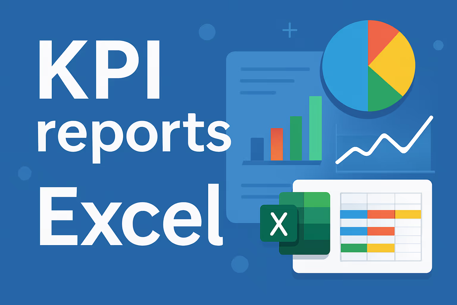
Why Excel is still a powerful KPI tool
Although many organizations today are investing in advanced BI tools such as Power BI or Tableau, Excel remains a very powerful and accessible solution for KPI reporting. Especially for small and medium-sized companies (SMEs), Excel offers a mix of ease of use, flexibility and low costs. It does not require an IT department, is widely known to employees, and allows you to quickly gain insight into performance, as long as you structure it properly.
What does a good KPI template look like?
A strong KPI template lays the foundation for clarity, consistency, and collaboration. A few essential columns:
- KPI name
- Description
- Measurement value (unit:%, quantity, €)
- Target value (target)
- Realization
- Variation (in% or absolute value)
- Trend (visual: via sparklines or icons)
Use color coding (e.g. green, orange, red) to quickly indicate performance. Also provide a field for comments or explanations so that deviations can be explained. At the top of your sheet, add filters so that users can quickly sort by team, region, period, or status.
Automate data with Power Query
Manual copying and pasting from other Excel files, CSVs, or tools inevitably leads to errors. With Power Query, available by default in Excel, you can automate the data supply. You can retrieve data from SharePoint, folders, websites, databases, or cloud applications.
Important benefits:
- You avoid manual intermediate steps
- Data is refreshed with one click
- You work with structured transformations (filtering, pivoting, merging)
- You can add parameters for flexible filtering (e.g. quarter 2 only, or team West)
Make it easy for yourself by saving and naming reusable queries. Optionally, document how the queries are structured in a tab.
Analyze KPIs with pivot tables and slicers
Pivot tables are ideal for grouping KPIs by department, customer type, or product group. You select your source data, create a pivot table, and choose relevant columns. For example, turnover per team compared to target value or the average number of errors per warehouse.
With slicers, you can make your dashboard interactive. Users can filter by region, product line, or period with one click. Combine slicers with timelines for monthly or quarterly selection. Pivot tables in combination with slicers increase usability enormously and are perfect for reporting to various stakeholders.
Visualization: simple but effective
Excel offers plenty of visual options for basic dashboards. Use column or line graphs for evolution over time. Pie charts are useful for distributions or budgets. However, avoid excess: too many visuals cause confusion.
Guidelines:
- Limit yourself to 1 KPI dashboard per tab
- Up to 8 to 10 KPIs per report page
- Work with visual hierarchy (key KPI at the top)
- Use colors consistently
Optionally, add small icons (such as the green up arrow or red down arrow) to visually reinforce trends.
Collaboration and version control in Excel
Use cloud storage via OneDrive or SharePoint to prevent multiple versions from circulating. Work with fixed naming conventions such as KPI_Rapport_Sales_2024Q1.xlsx and avoid “KPI_New_Definitive_V3_Echt_Definitive.xlsx”.
Add a changelog tab where you note each change:
- What has been modified?
- By whom?
- When?
- Why?
Agree on editing rights: who can modify, who can validate, who can approve?
Common mistakes when reporting KPI in Excel
- No data validation: Users type in freely, leading to inconsistencies. Use validation lists.
- Too complex formulas without explanation: Avoid nested
IF ()-five-level formulas without documentation. - Messy structure: KPIs spread over different tabs, without an overview. Work with a dashboard overview.
- KPIs without an owner: No one knows who is responsible for anomalies or incorrect data.
- No automatic update: Data is out of date when the report is opened. Automate with Power Query.
When to switch to Power BI or Qlik Sense?
Excel works great for static reports and limited datasets. But as soon as you:
- works with multiple data sources,
- you need real-time data,
- wants to filter by user,
- wants to publish or automate reports,... Qlik Sense of Power BI is the logical next step.
Qlik Sense and Power BI offer:
- automatic refreshes
- per-user security (RLS)
- better visualizations
- interactive dashboards
Want to delve further?
- Determining KPIs with the SMART method: how to clearly define KPIs
- KPIs for your financial reporting
- KPI dashboard, the complete guide: how to present KPIs visually with governance
- Beyond Excel and get started with InsightData Apps
Decree
Excel remains an excellent choice for those who want to get started with KPIs quickly and easily. You can already achieve a lot with templates, Power Query and simple visualizations. Those who report on a regular basis or need to share insights with others would do well to follow some best practices. And those who are ready for the next step will find a natural successor in Qlik Sense, Power BI, or the InsightData Apps.